-
코로나19 백신 접종 현황 차트 페이지 만들기 - (8) heatmapNode.js/예제 2021. 6. 4. 01:07
히트맵은 두 가지 범주를 기준으로 하는 데이터를 시각화한 차트다. 수치 데이터의 범위별로 색상을 달리하여 각 칸 내에 데이터를 표현하는데, 높은 수치르의 경우 진하게 표시하고 낮은 수치를 연하게 표시하는 방식으로 차트를 그린다. 때문에 구체적인 수치 확인 없이 색상 패턴을 통해 직관적으로 데이터 현황을 파악할 수 있다는 장점이 있다.
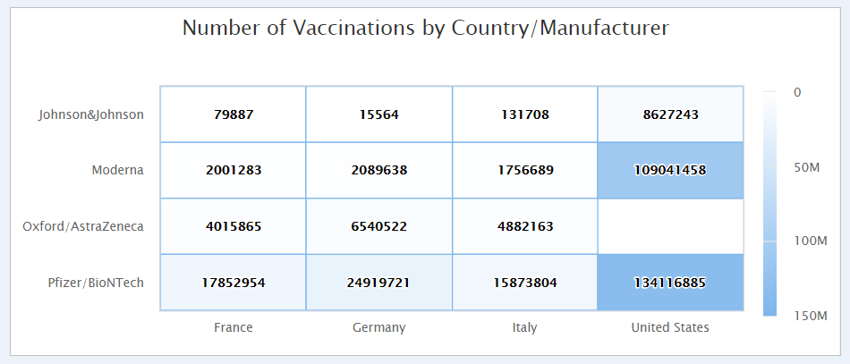
위 차트는 국가별/백신 제조업체별 백신 접종 횟수를 시각화한 히트맵이다. y축은 백신 제조사, x축은 국가 카테고리이다. 즉, 이 차트를 통해 각 국가별로 백신 제조사별 백신 접종 횟수를 알 수 있다. x축의 국가 조건은 특별한 기준 없이 프랑스, 독일, 이탈리아, 미국을 고정값으로 지정하였다.
router.post("/heatmap", async (req, res) => {
  const query = `
    SELECT location, vaccine, MAX(total_vaccinations)
    FROM "country-vaccinations-by-manufacturer"
    WHERE location='France'
    OR location='Germany'
    OR location='Italy'
    OR location='United States'
    GROUP BY location, vaccine
    ORDER BY location, vaccine
  `;

  const query2 = {
    "aggs": {
      "unique": {
        "terms": {
          "field": "vaccine",
          "size": 100
        }
      }
    }
  }

  const query3 = {
    "aggs": {
      "unique": {
        "terms": {
          "field": "location",
          "size": 100
        }
      }
    }
  }

  try {
    const data = await getDataUsingSql(query);
    const data2 = await getDataQdsl("country-vaccinations-by-manufacturer", query2, "agg");
    const data3 = await getDataQdsl("country-vaccinations-by-manufacturer", query3, "agg");

    const vaccinated = data.rows;
    const manufacturer = data2.unique.buckets.map(el => el.key).filter(el => el !== "Sinovac").sort();
    const location = data3.unique.buckets.map(el => el.key).filter(el => {
      return (
        el === 'France' ||
        el === 'Germany' ||
        el === 'Italy' ||
        el === 'United States'
      );
    }).sort();

    const resultData = {
      vaccinated,
      manufacturer,
      location
    }
    res.json(resultData);
  } catch (err) {
    console.error(err);
  }
});
country-vaccinations-by-manufacturer 인덱스(country_vaccinations_by_manufacturer.csv 파일의 데이터)의 국가 데이터 컬럼명은 location으로 되어있다. 조회 시 국가(location) 백신 제조사(vaccine), 백신 접종 횟수(total_vaccination)의 MAX 집계값을 컬럼으로 지정하고 where절에서 프랑스, 독일, 이탈리아, 미국을 조건으로 지정한다. 그리고 group by로 국가, 백신 제조사별 그룹화를 하였다. 이렇게 조건을 준 SQL 쿼리를 통해 데이터를 조회하면 [국가, 백신 제조사, 백신 접종 횟수]로 구성된 데이터가 출력된다.
query2, query3은 x축과 y축에 사용될 카테고리를 구하기 위해 사용한 쿼리다. SQL에서 distinct를 사용하면 간단하게 구할 수 있지만 엘라스틱서치 SQL에서는 distict 구문이 먹히지 않는다. 따라서 Query DSL 구문을 사용하여 조회하였다. unique 키워드를 사용하여 필드를 지정해주면 해당 컬럼이 가진 고유 값을 조회하여 출력해준다.
query2로 조회한 데이터는 백신 제조사 리스트인데, 시노백은 제외하였다. 시노백 사용 국가가 거의 없기 때문에 차트에 사용하기에는 부적절하다고 판단했기 때문이다. query3로 조회한 데이터는 국가 리스트이다. 조회된 데이터 중 위에 언급한 프랑스, 독일, 이탈리아, 미국만 필터링하였다.
heatmap.js
function drawHeatMap() {
  $.ajax({
    url: "heatmap",
    type: "POST",
    dataType: "json",
    success: function (result) {
      const { vaccinated, manufacturer, location } = result;
      const refinedData = [];
      for (const vData of vaccinated) {
        refinedData.push([
          location.indexOf(vData[0]),
          manufacturer.indexOf(vData[1]),
          vData[2]
        ]);
      }
      Highcharts.chart('heatmap', {
        chart: {
          type: 'heatmap',
          marginTop: 70,
          marginBottom: 40,
          plotBorderWidth: 1,
        },
        title: {
          text: 'Number of Vaccinations by Country/Manufacturer'
        },
        credits: {
          enabled: false
        },
        exporting: {
          enabled: false
        },
        xAxis: {
          categories: location
        },

        yAxis: {
          categories: manufacturer,
          title: null,
          reversed: true
        },

        accessibility: {
          point: {
            descriptionFormatter: function (point) {
              var ix = point.index + 1,
                xName = getPointCategoryName(point, 'x'),
                yName = getPointCategoryName(point, 'y'),
                val = point.value;
              return ix + '. ' + xName + ' sales ' + yName + ', ' + val + '.';
            }
          }
        },

        colorAxis: {
          min: 0,
          minColor: '#FFFFFF',
          maxColor: Highcharts.getOptions().colors[0]
        },

        legend: {
          align: 'right',
          layout: 'vertical',
          margin: 10,
          verticalAlign: 'middle',
          y: 25,
          symbolHeight: 200
        },

        tooltip: {
          formatter: function () {
            return '<b>' + getPointCategoryName(this.point, 'x') + '</b><br><b>' +
              addComma(this.point.value) + '</b><br><b>' + getPointCategoryName(this.point, 'y') + '</b>';
          }
        },

        series: [{
          name: 'Number of Vaccinations',
          borderWidth: 1,
          data: refinedData,
          dataLabels: {
            enabled: true,
            color: '#000000'
          }
        }],

        responsive: {
          rules: [{
            condition: {
              maxWidth: 500
            },
            chartOptions: {
              yAxis: {
                labels: {
                  formatter: function () {
                    return this.value.charAt(0);
                  }
                }
              }
            }
          }]
        }

      });
    },
    error: function (request, status, error) {
      console.error(error);
    }
  });
}


function getPointCategoryName(point, dimension) {
  var series = point.series,
    isY = dimension === 'y',
    axis = series[isY ? 'yAxis' : 'xAxis'];
  return axis.categories[point[isY ? 'y' : 'x']];
}
차트를 그리기 위해서는 [y좌표에서의 위치, x좌표에서의 위치, 표시 데이터]의 형태로 된 데이터가 필요하다. y좌표의 위치는 위에서부터 0, 1, 2, 3...의 형태로 지정해주어야 한다. 즉 이 예시에서는 Johnson&Johnson의 값은 0, Moderna의 값은 1이다. 마찬가지로 x축은 왼쪽에서부터 0, 1, 2, 3...의 형태로 지정해주어야 한다. 즉, France는 0, Germany는 1이다. indexOf 함수를 사용하여 배열 내 각 데이터의 위치값으로 숫자값 형태 변환을 하여 데이터를 재가공한 후 차트에 전달하였다.
'Node.js > 예제' 카테고리의 다른 글
코로나19 백신 접종 현황 차트 페이지 만들기 - (10) search 페이지, datatable, 검색 기능 (1) 2021.06.05 코로나19 백신 접종 현황 차트 페이지 만들기 - (9) map 페이지와 highmap을 활용한 지도 차트 (0) 2021.06.04 코로나19 백신 접종 현황 차트 페이지 만들기 - (7) line chart (0) 2021.06.03 코로나19 백신 접종 현황 차트 페이지 만들기 - (6) column chart (0) 2021.06.03 코로나19 백신 접종 현황 차트 페이지 만들기 - (5) highchart 라이브러리와 piechart (1) 2021.06.01